|
Eclipse |
| Submitted By Richard Gilbert (dcentity2000) |
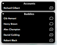
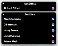
DescriptionIncludes:1 x Contact List Layouts 1 x Contact List Colour Schemes 2 x Icon Packs A dark contact list containing two icon packs, one lifted from Apple's Safari and the other a simple invert of the iChat Bubbles pack 1.1 Changes: Tab icons for "Negative" pack now show Rich:: CommentsYou can reply to individual comments by clicking the "Reply" link next to each. # by on 06/24/05 at 00:17:44Great theme and layout. I love the negative icons, but for some reason in my chat window tabs, the icon does not appear at all. There is no empty space for it next to the contact's name, but if I mouse over the area where the icon usually is, the close X appears behind the text. Not sure if this is an icon bug or not.
# by on 06/26/05 at 18:48:13I love this style; it reminds me of the "clock" dashboard widget. Now you just need to make an add-on for the message style!
# by Dylan1077 on 06/27/05 at 02:25:22Really cool negative status icon, but maybe make a version of the Safari one thats something like green for available and red for away, I kinda think its easier to distinguish status with those colors. Either way, nice list :D
# by Lavo on 07/29/05 at 22:04:10pretty nice..but in the safari-ish icons set, there's no mobile icon
# by telic.detour on 08/27/05 at 00:24:58Nice dark theme. The inverted iChat icons are a good idea, but could use a little work. The original iChat icons are slightly darker in the pointed corner, and this translates to a slightly being slightly lighter in the inverted set, making them look kind of odd. Also, they would work better with more dark styles if the insides of the bubbles were partly transparent.
Post a New CommentYou must be logged in to post comments. |


# by Abs on 06/22/05 at 11:20:07