|
Urbn_RST |
| Submitted By Ryan Scott Tandy (RSTtm) |
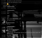
Descriptionurbn is simple, functional, with just a touch of style. if you're tired of glossy, shinny, bubbly, over the top rounded corners with drop shadowed nonsense then urbn's for you.urbn works well with your own background images too. all feedback is welcome. thanks goes out to Jim Rodovich (dzhim) and Andrew Raffensperger (nsraffy) for their work with Eclipse, which this is heavily based on. ImagesCommentsYou can reply to individual comments by clicking the "Reply" link next to each. # by on 05/09/05 at 22:29:49lots of smokers out there! :)
i like it better with no rounded corners anyways. minimal baby. # by on 06/13/05 at 12:23:56Is there a way to display the user icons? I really like this message style. Thanks!
# by Anonymous on 06/16/05 at 07:51:05great job. One query: could you make it more like Terminal? that ould be really cool
# by thesilverfox06 on 07/17/05 at 13:24:28Great style! Just one bug that I've found: If a person's alias is only 2 letters (my alias is just "Me"), the letters appear on different lines, i.e. the "M" will be on the first line, and the "e" will be on the second line. Other than that, this style is awesome.
# by on 07/18/05 at 16:50:07Excellent, excellent theme! Only issue I am having I think is the same as the previous post. An alias from MSN displays on 2 lines. For me the alias is 4 letters not 2 like the previous post. It only displays on 2 lines when I have (preferences > advanced > messages)just the alias being displayed or when I have "Use Custom Name Format" de-selected. When I display it by Alias (username) it works fine.
# by dkleinschmidt on 08/14/05 at 00:21:52Same problem with me, it happens with three-four character names (as far as I can tell), but only SOME of these names. For instance, 'Dave' and 'Noa' display with the last letter of each on the second line, whereas 'Tony' displays correctly.
# by dkleinschmidt on 08/14/05 at 00:39:55also (sorry for two posts) what would be reaaaally cool would be a mod for the actual chat window (i.e. what some people have done to create the brushed-metal look of the original ichat, except something that matches the smokey look of what you've already created and I like very much).
# by cupton on 10/27/05 at 13:25:16Still in my opinion the finest message style out there. Any plans for a user icon version? Would love to see that! ;o)
# by westcoast021 on 11/01/07 at 00:43:24wow...clean, hot, professional, outstanding. thank you so much!
Post a New CommentYou must be logged in to post comments. |


# by on 05/07/05 at 23:21:32