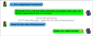
|
iChat Clone 1.2 |
| Submitted By Chris Brummel (captphatsidy) |
DescriptionThis is iChat Clone with a fix for Mac OS 10.3.9. I posted this before I got in touch with Michael Moen (wasn't thinking).After WebKit updated with 10.3.9, the MinHeight attribute was corrected; causing the chat bubbles to break. I took off about 12px from the MinHeight in the CSS and fixed it. I also added a Black & White style. Also, thanks to Jason Sonnenschein, the problem with double posts is fixed. CommentsYou can reply to individual comments by clicking the "Reply" link next to each. # by Anonymous on 04/20/05 at 04:08:30I'm having alot of message view problems as well. It seems to have to do with the length of the message and the size of the window.
# by Anonymous on 04/20/05 at 04:10:16My mistake, redownloaded it and now works fine. One other thing I did notice however is the inability to use custom backgrounds...
# by on 04/20/05 at 11:50:27I still have a very small line through my single line messages. However, the line is a lot smaller then it used to be before update.
# by on 04/20/05 at 16:09:04That's strange about the height being stretched. Works fine on mine...
You can fix it yourself though: Go To home/Library/Application Support/Adium 2.0/Message Styles/ Then control-click "iChatClone" and select "Show Package Contents". Navigate to Contents/Resources/common.css Open that document in a text editor (i.e. TextEdit). On the 10th line is "min-height: 28px;". You can edit that value until it is correct in Adium for you. That's all I did. You will have to close and relaunch Adium for the changes to be reflected. Also, if you want new colors: In the same folder as the "common.css" file, there is a folder called "Variants". Inside that folder are the documents that contain the color values. You can duplicate one, change the name, and then edit the RGB values in the doc to make a new set of colors. -Chris # by captphatsidy on 04/21/05 at 17:18:58I changed it from "min-height: 40px" to "28px". The extra line through my bubbles was 12 px tall, so I just subtracted 12px from the min-height. Worked with mine...
# by on 04/23/05 at 18:06:16It doesn't fix that thin line that goes through singel line messages... How do you fix that??
# by on 04/24/05 at 11:08:35Oh, sorry it does fix that, but the bubbles still break, when you send a double line message.
# by on 04/24/05 at 22:40:07Yeah, double posts still break. With .77, you can turn that off in the "Advanced" prefpane. If you're using .80 beta, they took that feature out, for some reason...
# by on 04/25/05 at 16:56:22I made a work-around a while back for the double post problem. It doesn't fix the problem, it just draws them as if post consolidation is turned off, even if it's not. It wasn't tough, but also not necessary, considering the pref. setting
# by captphatsidy on 04/26/05 at 21:15:04I took the changes that Jason made and updated iChat Clone to 1.2. I also cleaned up some of the colors. The changes should be posted when the Mods review the update... Thanks, Jason... -Chris
# by Anonymous on 04/28/05 at 04:06:51Love the changes, still not able to change the background?, other than that its perfect. Thanks!
# by Daveecee on 04/28/05 at 21:30:43Whenever I try to change or make new color schemes, I can not edit the font color. I tried to make a Light vs Dark using the Dark vs Light scheme.
I switched the color values around and moved the color:#fff to the Dark end of it, but it did nothing in terms of font color. How do I change that? # by captphatsidy on 04/29/05 at 17:00:15Off the top of my head, that should have done it. Do you have your color in the Preferences overriding the CSS? Also, check out iChadium. That was just released and has a bunch of different colors like you're looking for. -Chris
# by rezon on 05/05/05 at 17:20:18Would be nice to get some decent color variations with this. Not a fan of the ones it comes with... otherwise, great job.
# by on 05/07/05 at 02:11:18I'm a big fan of the theme, especially after I've personalized it a bit. I'm especially fond of the hidden time stamps. However, I'm having some window-sizing issues. The horizontal scroll bar is behaving a little strangely. The bar appears when there appears to be no reason for it to be there (meaning the window should be plenty wide enough). Sometimes it won't go away until i make the window the width of the whole screen. Any idea what's going on? Thanks!
# by SuperUnknown on 05/10/05 at 13:20:18Doesn't work well with Yahoo Conference. I was chatting with two other people and since they didn't have user icons, I couldn't tell who was saying what. They both appeared on the left with the same color. It would be nice if you could include the option to display user names somehow.
# by splitsurround on 08/14/05 at 13:39:24So...is there ANY possible way to change only the background color? Aside from the painful white, I love this message view...
# by captphatsidy on 08/16/05 at 12:33:45Yeah, read up in the comments from 4/20/05 to change the colors...
# by soulcreeper on 11/20/05 at 14:14:17is there a way to prevent the bubbles from proceeding out og the window?
like there is a very long line sent that it doesn't break it apart but keeps in one piece creating a horizontal scrollbar image of screenshot: http://files.soulcreeper.net/temp/scr...eenshot.png Post a New CommentYou must be logged in to post comments. |


# by Daveecee on 04/20/05 at 00:54:57
Also, can we get the default iChat color schemes as well?