|
xAdium |
| Submitted By sdh |
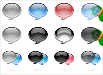
DescriptionA bubble which only displays status with color to keep it simple and clean.All animations have lots of frames to make them as smooth as possible. Not much more to say really. Download, try it and give me some feedback :) Changes~ 0.3Removed the ugly yellowish idle bubble, it's now the same as away. Replaced xAdium db with a new icon named xAdium Black & Blue since it was hard to seperate online and alert mode on the old one, this new icon is much clearer. Added new icon named xAdium Dark. ~ 0.2 Included the xAdium db icon. ~ 0.1 First release. ImagesCommentsYou can reply to individual comments by clicking the "Reply" link next to each. # by BrianWoTheOb on 04/14/05 at 22:22:56Good job. Simple concept but well executed. Awesome job on the animation.
# by The iMacGuy on 04/15/05 at 00:32:48# by STIAFL on 04/15/05 at 01:00:18i like it alot, what about taking out that white line that hugs the bottom of the dock bubble? right now it kinda looks like its looking up... if u know what i mean? looks really good tho! awesome job :)
# by Tobias on 04/15/05 at 06:20:27For a more serious approach, do consider making this the default icon instead of the duck.
# by on 04/15/05 at 18:04:19Thank you, I hated to see the duck in the dock, it was just awful and ridiculous, while your work is extremely simple and welcome.
# by Auric on 04/17/05 at 07:08:56The duck is awesome. It isn't awful. This dock icon is great too, but I'd like to see the duck as default rather than such neutral thing. The duck makes adium cool and famous and... bespoken ^.^
# by Conlan Spangler on 04/18/05 at 05:21:34I really like this icon, but the from available to away is too subtle. I'd prefer if it was a different color. But really great job.
# by on 05/03/05 at 18:19:00hey! I'm a 3D designer, I can do cool animations but i don't know how I get them to adium, anyone who knows? mail me... Sorry for writing here by the way :/
# by magickmas on 05/07/05 at 18:19:11This is quite possibly the best chat client dock icon ever.
Please seriously consider using this instead of that awful duck. # by mike on 07/08/05 at 01:02:38so i'm not the only one who's had this gorgeous dock icon on for months!
# by KatharineHolmes on 07/23/07 at 01:52:42When I first saw the image above, I thought the duck popped "around the corner" when there was a new message. Maybe it's just me, but that seems like a fun way of letting people know there's a new message.
# by sonic_berto on 08/17/07 at 13:37:59is it possible to find old icon with the two bubbles pink'n'blue?
thanks in advance... # by Brighid on 11/08/07 at 18:56:02I love it! Beautiful! The animations are very smooth. Thank you for making this.
# by whitenoise on 02/11/11 at 21:31:07Elegant, clean, smooth animation...This is an excellent icon set.
Post a New CommentYou must be logged in to post comments. |


# by 61Tipo61 on 04/14/05 at 20:19:44
# by yaro6 on 10/07/09 at 15:54:08