|
|
StatusColours |
| Submitted By two peak (twopeak) |
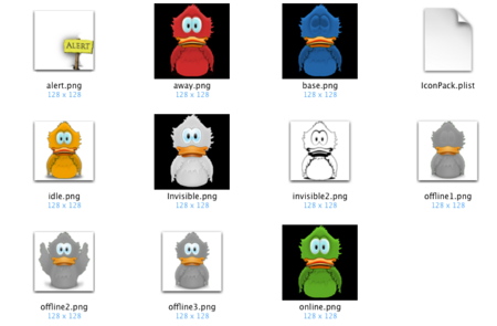
DescriptionThis icon set will change colour when the status changes.Online = green ducky Away = red ducky Idle = orange ducky (but you won't see this as idle status is only when you don't touch the keyboard) Connecting = blue duck that is opening/closing eyes When it wants attention (new msg), it will hold a sign saying "alert". ChangesNow it shows an envelope when you have a msg, instead of the english word "alert".Invisible is now white Connecting is a gray ducky (flapping) The base stays blue (eyes closed) The old icons are still enclosed if someone preferes a transparent icon for invisible. ImagesCommentsYou can reply to individual comments by clicking the "Reply" link next to each. # by Stuphalina on 04/09/05 at 15:05:48Wow! I had that idea a LONG time ago (not accusing you of anything other than great minds think alike!)
Nicely implemented. # by Daniel on 04/09/05 at 15:50:38Nice. it will be cool if u could make another dock icon with only one color (i reaallyy like the blue one). I mean like the original adium icon but with this blue color.
# by on 04/10/05 at 16:39:49Stulphalina: I was also surprised nobody had done it before me... I think I'm going to update it a little bit more to make it more interesting. But later...
Daniel, I don't see the point of having a new set with one colour? Adiums already provides uniform coloured icons. That's where I got mine from... if you just like the blue, and dislike the colours Adium provided, you chan change it yourself with photoshop. Right click adium, "show package contents" go to contents/Dock icons then "show package contents" of the color you want to edit, and edit the png files in there. To alter the colours you can use the "replace color" in photoshop. every photoshop-analphabete (like me) can do it by playing with the values # by sarah on 06/29/05 at 17:23:42hey,
I love it, except that when I am in invisible mode the icon turns red, as in 'away' and not see through like it shows in the preview.. ?? How come # by twopeak on 07/11/05 at 06:44:57invisible state has only been added in .8.3 (right now in beta)
If you download it; the icon should magically wrok) # by twopeak on 11/15/05 at 18:37:57if somebody has requests for a next version, just shoot... I'll be updating the invisible state and I'd like to find a better way for the new messages alert
# by boredzo on 07/02/06 at 02:53:15It really should use the same colors that Adium uses in its default status icon set.
# by twopeak on 07/02/06 at 07:10:32To be honest, I'm too bad with photoshop to make a grey (offline) and a white (invisible) Adiumy.
If people are interested in the iconset, I'll try harder. I can probably make time next two weeks. Post a New CommentYou must be logged in to post comments. |


# by twopeak on 04/08/05 at 20:45:36