|
Spotlight 1.4 |
| Submitted By Andy Allcorn (bob_the_gorilla) |
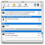
DescriptionSmooth scrolling now fixed, thanks to zau's updated javascript. One file only now - in 0.8, show header=smooth scrolling, hide header=standard scrolling. In 0.7x, to disable smooth scrolling you have to control-click, "show package contents", find & delete "header.html".Sort of Spotlight-y Tiger-y type feel. The blue for the header is actually a standard Apple highlight colour, screenied from the Finder. 1.4 - fixes smooth scrolling. 1.3 - minor update - hopefully put a temporary fix in place for the time-alignment problem, changed the status display to better fit with the Spotlight window design ethic. 1.2 incorporates smooth-scrolling, courtesy of Eoban Binder. PS. Not actually based on the delicious Candybars - anyway, I claim prior art for this ;) ImagesCommentsYou can reply to individual comments by clicking the "Reply" link next to each. # by bob_the_gorilla on 03/16/05 at 23:40:32Actually, it's sort of based on Minimal, and rather more inspired by Safari RSS, but that sounds weird... And you're right, I didn't try Candybar until this evening - I hadn't realised /quite/ how similar they are! Candybar is prettier :D
# by Brutal on 03/17/05 at 12:15:10Candybar IS prettier, but it doesn't have buddyicons like this one has. Every theme should - At least every 0.7-theme
# by Jason on 03/17/05 at 18:49:16Sometimes I feel like buddyicons, sometimes not! And Candybar is great for when I don't. Not every theme should have it.
# by bob_the_gorilla on 03/18/05 at 08:50:27Ah, I see what you mean now! I'm not sure which build that's from, I know I've seen something like it before. But Apple's http://www.apple.com/macosx/tiger/spo...tlight.html Spotlight page actually shows colours more similar to mine. Plus, I wouldn't want to look like a complete Candybars clone ;)
# by zaudragon on 03/19/05 at 00:04:46Just noticed that! Wow, it sure looks different; I liked the old gradient better ;)
# by on 03/19/05 at 23:28:58i think i found a bug in the message style. i changed the text display font size to 11 (instead of the default 12) and it looked great until i sent more than one messsage in a row. when i had multiple message under my name before my buddy replied, the time moved to the left with each message. i'm not sure how else to describe it. if you need a screenshot, email me and i'll send you one.
# by bob_the_gorilla on 03/20/05 at 01:42:07Thanks. That's actually a known problem, I'll have a 1.3 release that alleviates this a bit up soon.
# by on 04/06/05 at 20:47:11why don't you integrate the classic one as a variant in the new one? it would help to reduce the flood of my installed styles, and provide a better overview.
# by bob_the_gorilla on 04/06/05 at 22:29:30It's impossible to integrate these two I'm afraid. The only difference is whether it has smooth scrolling - can't you just choose? :)
# by bob_the_gorilla on 04/16/05 at 01:08:41The version of this style which incorporates smooth scrolling will not scroll at all under 10.3.9 and up (including Tiger). Please use the standard-scrolling Spotlight Classic, which is already included in the archive.
# by zaudragon on 04/26/05 at 04:06:13Oh and the header of my blog, Zaudragon++; was based off of the gradient used in Mac OS X Highlights too.
I really like that gradient's colour. # by 61Tipo61 on 04/28/05 at 18:23:23How would you make background colors visible in this style? I know candybars, and Mockie do it. What exactly needs to be put in the coding?
# by on 06/12/05 at 00:11:12Is there any way you could change the default font on this to Lucida Grande?
JPGK- Post a New CommentYou must be logged in to post comments. |


# by zaudragon on 03/16/05 at 23:29:44