|
Candybars |
| Submitted By Peter Simonsson (pss) |
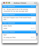
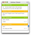
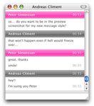
DescriptionCandybars is a simple message view style without buddy icons and other unnecessary distractions. It comes in 25 different color variations.1.1
1.0
(If the bars above messages are flat, you need to upgrade to Candybars 1.1.) CommentsYou can reply to individual comments by clicking the "Reply" link next to each. # by on 03/14/05 at 12:34:56That's one of the best looking message styles Ive seen, but I miss to see the pic of the other person. If it could have an upper band with the name on it like the Brainbite message view style it would be more than awsome. I would do it myself but I dont know how to do that.
# by drunkenlink on 03/14/05 at 19:57:51AMAZING.
i just wish you could like.. make a top bar that would always show like what time the convo started and the other person icon. but other than that..its stellar # by Jon on 03/14/05 at 20:44:03This is awesome, one thing tho you should include user icons in it :)
# by on 03/14/05 at 21:18:40This is an awesome style. It is almost exactly what I have been waiting for. Would you consider, in the future, doing a mod of this where the name bars are flat instead of glossy, like the pastel bars that show when someone goes away. That would make this the best style ever ever ever. But I am very fond of it the way it is now, anyhow. Great work!
# by pss on 03/14/05 at 21:47:10Thanks for the comments. For everyone asking for a header: I played around with the idea but didn't find a solution that offered any advantages to not having one. In 0.8 you can have the buddy icon in the toolbar, and the name of the person you're talking to is in the window's titlebar. Kristen: Flat name bars is definitely something to consider... I can see that the glossy bars doesn't fit in every situation.
# by czarlimit on 03/14/05 at 22:29:53Wow, found this yesterday and its simply amazing. At first I was looking for the option of adding buddy icons..in fact, I was willing to go into the source and play around with it to try to add but eventually got lazy and wanted to see if anyone had asked for it on the site. After reading the message above I thought for a moment, and then realized your intentions...it's quite annoying having the icon display after each message...and since you say that in Adium 0.8 we will have the icon in the titlebar, it makes much more sense to leave it out of the actual theme...at least for now. Anyway, keep up the great work and lets hope 0.8 comes soon! Very soon!
EDIT: However, I'd like to make a suggestion: When long links are entered, maybe the text should be wrapped to the next line? I think it would look a little nicer. Perhaps a possible left-floating timestamp? Or does that not look good...anyway, as I said before, keep it up! # by on 03/15/05 at 01:11:38I think you should make the green a bit less vomit-ey. The other colors are awesome, but im looking for a good green, because my desktop and shapeshifter theme are both a lime-y green. So if you could change that a bit, that would be awesome.
# by Junpei on 03/15/05 at 06:29:24Totally awesome! Great color variations too. I would also ask for buddy icons somewhere, but if it's true that 0.8 will support them in the toolbar, then perhaps it's best left as is.
I also agree with czarlimit's comment about long links. I was using Mockie before, and it's really ugly how long links create those scroll bars within the chat window... # by Junpei on 03/15/05 at 06:31:31BTW, I like the green as is, that's totally the right color IMHO. ^^ This would fit in well with Tiger....
# by on 03/15/05 at 19:39:02Very cool, but one thing, it would be cool if you could have a Header with user icons and so, like in Big Icons, if you could combine that with this, (the colors and so on) it would be the greatest messege style ever
# by Susan on 03/15/05 at 22:42:15as everyone else is saying, it looks great but buddy icons would make it perfect. :)
# by on 03/15/05 at 23:30:04Verrrry nice. Perhaps there will be a future version with slightly slimmer color bars? Other than that it looks fantastic. :)
# by macaddct1984 on 03/16/05 at 00:36:21Awsome theme! The colors and sharpness is excellent. Great great theme.
# by apple_templar on 03/16/05 at 16:01:20good enough to replace my default minimal message view for a while, bravo.
# by bob_the_gorilla on 03/16/05 at 21:01:57Pretty. Have you considered adding the characteristic Apple flick up/down at either end of the bar? For reference, see Safari's buttons :D
# by on 03/17/05 at 05:47:58OHHH this is beautiful! It's simple and has a great selection of colors. GREAT JOB!!
# by on 03/17/05 at 15:34:48You should do a contact view style to match this... That would be cool!
# by on 03/18/05 at 02:03:16kylan wrote:
>>>Perhaps there will be a future version with slightly slimmer color bars? # by on 03/20/05 at 01:15:37This is great. It really should allow user icons, though. That would make it an AWESOME theme.
# by on 03/21/05 at 12:03:10Wonderful, beautiful, delicious theme. How about a blue/pink combo in the next version?
If avatars will be visible in the toolbar, don't worry about 'em. # by on 03/23/05 at 22:06:36i think it looks fantastic without avatars. i hate seeing other peoples icons, i don't feel the need for them. i like things to MATCH. including avatars. so the 19 color schemes? excellent idea.
# by ianweller on 03/24/05 at 22:26:42make it de default! it's so mac-like.
and those who miss avatars, upgrade to the latest adium beta, you can put the avatar in the toolbar :) # by Noah on 03/31/05 at 14:38:32I love the look of this theme and would use it in a heart beat. But for some reason when I try to use it, I get only flat colours not the cool 3d effect with them. And I downloaded it because of the look in the pics. I am using the newest beta of tiger so it might be a problem with tiger and not how you wrote it. If that is the case I will be looking forward to when you update it for tiger.
thanks for the amazing theme -Noah # by gyre on 04/06/05 at 04:12:44Very nice, excellent style. I like the green how it is, it looks much better than most green variations that I have seen.
# by on 04/06/05 at 15:50:14I find this to be the most awesome theme for adium, I'd like to see a variation with usericons beside the text or in a bar above. Just for us guys who like our and the people we chat with -s icons. Keep it up!
# by on 04/13/05 at 19:05:29I have the same problem as Noah, above. Using Tiger 8A425 here, and its all flat. Still nice, just... flat. I think it might be something to do with the way webkit is implemented. I'm going to have a little tweak and see if I can fix it.
Awesome style though. # by pss on 04/13/05 at 20:18:05The tiger issue will be fixed in the next version (1.1), which I'll release as soon as possible. By the 29th at the earliest, but it all depends on when I get tiger in the mail. :)
# by on 04/15/05 at 10:08:14Well, I had a little play with the CSS but couldn't seem to fix it. The code looks totally sound to me, so I have no idea why its not working.
Bah. I'd be more than happy to be your code monkey if you care to throw some suggestions at me, if one works I can just email you the update and save you all the bother. Not to mention I'd feel deserving of this developer release, because I'd have helped out in some tiny way. # by pss on 04/16/05 at 00:27:1661Tipo61: Did you update to 1.1?
mathuaerknedam: I had positioned the background image within background-image. When I used background-position instead, it worked fine. So it was kind of a stupid mistake. # by 61Tipo61 on 04/16/05 at 00:32:25I just downloaded and reinstalled it, and now the bars are flat...
# by john on 04/16/05 at 01:16:10this is really messed up. some text is blocked in color, some isnt. there is no candybar shape at all!!!
this is from 10.3.9, adium .77, candybars 1.1 WTF!!! # by Susan on 04/16/05 at 03:18:52oh no! it's messed up! and now i don't have my original! :( pleeeease fix this sooooon!
# by Ian on 04/16/05 at 03:31:54I'm having the same problem as John. OS X 10.3.9, Adium .77, Candybars 1.1.
# by pss on 04/16/05 at 09:23:04Apparently, I had upgraded the message style to the new format that is only available in Adium 0.8, and since I was in a rush to fix the issue with 10.3.9 I forgot to try it in 0.77 before I uploaded. I've uploaded a new version of 1.1 that will work. Sorry for any inconvenience.
# by on 04/17/05 at 21:59:42nice, but why is it so FAT?? could you make the color bars thinner to waste less screen space?
# by Rasmus on 04/17/05 at 22:34:39Oh! Peter. Had no idea you used Adium, or even Mac!
Whatever happened to grafiskt forum? You still hanging out there? Nice stuff btw. # by on 04/20/05 at 17:50:36this message view is still not working for me. the first option of "blue" has the candybar format, but no colour. any option after that has the colour but is NOT in a candybar format. just blocks of coloured text.
is there any way i can get the old set? # by pss on 04/20/05 at 18:08:56Susan: Which version of Adium and OS X? Did you try downloading it again? Cause I think I fixed that... it was an issue with the version of the message style not being compatible with Adium 0.77.
# by on 04/20/05 at 20:25:19i'm using 10.3.9 and 0.77. :-/
is there some way to delete message views from adium after installing them? perhaps i screwed up the installation. :-/ # by pss on 04/20/05 at 20:49:17The message styles are stored in ~/Library/Application Support/Adium 2.0/Message Styles/ . Try removing Candybars.AdiumMessageStyle and installing a new copy. Adium should replace message styles when you install new ones with the same name, but it's worth a try.
# by on 04/20/05 at 20:55:02yay! thanks! that's what did it. somehow i had two candybars files in there.
thanks for you're help. :D # by Sembazuru on 06/23/05 at 03:37:47I'd like a blue in / graphite out colour scheme in the next version. The current blue in / grey out colour scheme draws too much attention to outgoing messages, in my opinion.
# by computerdude33 on 09/28/05 at 16:36:12This looks too much like your Candybars Growl style. Which I use as default. 5/5
# by KPDover on 02/07/06 at 18:55:50I love this theme, but I don't use it for my regular message style because it doesn't show icons (could just be up at the top, or in line with the text), and the colors besides blue are not appealing to me. The blue is gorgeous, but every color I want to pair it with looks a little "off," especially green. And I can't use blue-blue because without icons it's too hard to tell them apart. So icons and a variant of green that's not so sickly-looking would make this my absolute favorite style.
# by frankiefrank25 on 02/20/06 at 11:24:00this looks horrible. u dont see the persons icon and that's just sucky.
gosh! # by Shark!! on 08/30/06 at 21:17:53i want the older version that can be seen in screenshots :'( with larger bars..
# by Daniel on 12/16/06 at 10:32:05MINBLOWING! This is absolutely my favourite message style! It is Candy! The colors are obviously great, keep up this good work! :)
# by blackpug on 02/16/07 at 20:03:45I would be using this its just that I dont know how to change the text color to white because im using a black background. I dont think i can edit this in growl either. Any help will be appreciated!
# by jr98664 on 06/03/07 at 18:47:58I'm using mine with a pinstipe background. It looks superb. Like a quasi-spotlight or something.
# by freshmas on 11/13/07 at 06:11:41I literally spent... well, I don't know how long I spent looking for this message layout after installing leopard from scratch and neglecting to remind myself what I was using, but it was well worth it.
Seriously. Best message layout by far. # by AudioFreak on 02/04/09 at 15:40:46Thanks this one looks great! Could you add support for conact images in future updates? Thanks!
Post a New CommentYou must be logged in to post comments. |


# by 61Tipo61 on 03/14/05 at 02:02:48