|
Jewel |
| Submitted By Reid Beels (reidab) |
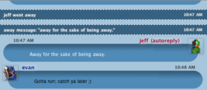
DescriptionThe goal this style is to enable the user to choose any background color and have the theme adapt to suit their choice. Included are several variants for chat layout as well as a number of preset colors. Enjoy!ImagesCommentsYou can reply to individual comments by clicking the "Reply" link next to each. # by on 05/16/04 at 04:20:03I like the color options that you included. Text could be a little easier to read under graphite.
# by JBUK on 05/16/04 at 08:50:16This is a very pleasant message view. it does however seem to have a problem when you change the fonts to say "lucida handwriting" then the graphics tend to not quite align up correctly. i noticed this as it's the font i use.
It also looks rather strange if you chose to have a transparent png image to appear over the background colour. That aside its a very nice message view indeed... gets 4 ducks from me. # by on 05/16/04 at 13:14:37Not bad. I do with that the round chat areas were thinner. They seem to take up a lot of room even with one line of text.
# by on 05/16/04 at 14:01:47Very nice. The 'snow' variant seems to be broken, though... might it not be importing main.css?
# by Scottish on 05/16/04 at 15:44:14Pretty hot stuff. One complaint, though: If you select a custom color, pulling down the menu and selecting a variant does not revert it back to that variant's default colors. It keeps the custom color forever.
Nice work, though. 4 ducks :) # by on 05/18/04 at 03:00:42Time for a bug fix release, soon... Just as soon as I get done with these piles of schoolwork... *sigh*
# by _valster. on 06/29/04 at 13:53:53I love how I can pick from all those pretty colors! Very original design. I like it a lot!
# by DJ_FoX_MaC_ClouD on 07/28/04 at 20:11:22I love this theme, i just wanted to know if you can update this Xtra because we can't see majs on .63 and the head of the message is cut !
Thanks i like your job ! # by on 08/12/04 at 22:02:36Looks great. I'm getting the gap issue (.63), however--but only if the message window is larger than a certain size. Any chance the alternate setting could be used with more colors.
# by on 09/01/04 at 22:11:00ok i may be stupid but how do you sync the icons you have for the people with the duck ones in this. it seems none of mine sync over, i just get the default icon. Sorry if i'm missing. and yes i have the use address book images as contacts' icons checked.
# by on 09/02/04 at 08:52:57# by n8tron on 09/02/04 at 13:04:03ok i figured out...i completely missed the use contact icons button... terrible sorry
# by on 09/21/04 at 06:32:19I love this theme, but after a while, it bogs down like mad. Seriously, I've had Adium hang maybe four or five times since I've started using this theme. I chat a lot, and having one long chat open in Jewel can slow Adium to the point of incapacitating the whole program. I can just close my window and reinitiate the chat, but that's hugely inconvenient. This is especially bad because I love the style so much.
# by on 11/17/04 at 08:12:32nice looking but for the little blip above the time. there seems to be a bit of excess border around the chat text too. the alias and time fonts are too large and don't seem to modify when i change the css which makes no sense to me but it is still quite nice
# by on 04/07/05 at 18:27:28I love love LOVE this theme, but I'm having the same problem as GPaz -- namely, that it starts to really bog down after awhile. Eventually even closing the window doesn't work and I have to restart the program, or even the computer. Curious if you know why that might be?
Otherwise, fabulous job -- I love all the colour variations and the design is elegant and beautiful. # by alexsaur on 04/22/05 at 02:33:41i love this message style, but when i upgraded to 10.3.9, it totally messed up the formatting on a lot of things
pls update! # by gilana on 08/26/05 at 10:52:34Does not seem to recognize hard returns for me -- the messages are just strung together.
# by Corny on 06/05/06 at 07:19:36If the text frames were really round, the theme would be wonderful :( But it's angularly at the lower side and under the avatar is the mentioned gap..
# by Corny on 06/05/06 at 07:20:17If the text frames were really round, the theme would be wonderful :( But it's angularly at the lower side and under the avatar is the mentioned gap..
# by zyxpink on 02/06/07 at 23:39:48i love the graphics.. but the only thing is that it doesnt start a new message if someone sends two things in a row... other than that tho... GREAT!! totally awesome dude! haha
# by tasmanian_devil on 03/26/07 at 02:03:15OMG Really this is the greatest message style since like.. I dunno.. Forever! It seems like the style is like.. I dunno.. making an imprint, and denting it! IT LOOKS AWESOME
Post a New CommentYou must be logged in to post comments. |


# by on 05/16/04 at 04:01:41